Ottica Rossitto di Valentina
We will create a layout that will guarantee continuity in your shop’s décor.
We will give you a unique design to bring out your visual identity.
We will create a layout that will guarantee continuity in your shop’s décor.
We will give you a unique design to bring out your visual identity.
The store is located on a main street in downtown Avola, within walking distance of the main square. It can also be reached by car and there are some parking spaces available in front of the store.
The customers are loyal and quite attached to their eyecare professional, Valentina, to the point where they will drive in from neighboring towns. The store has a rectangular floorplan with windows along the longer side facing the main street.
The design had become outdated, with mismatched furniture and spaces that weren’t well organized in terms of functionality. The display was too bulky and lacked dedicated lighting. The message conveyed to the public was ineffective, with overlapping messages no longer in keeping with the times. The storefront windows did not allow potential customers to get a clear view inside. The positioning of the sales counters proved to be of little help in boosting sales.

The goal was to give new life to the store so they could reposition themselves in the market and vary their offering with a wider array of products.
The sales counter was kept in the center giving the store an “L” shaped layout with a 45° angle meant to guarantee a good flow from one area to the next, without any sharp corners facing the entrance which could seem too “aggressive.”


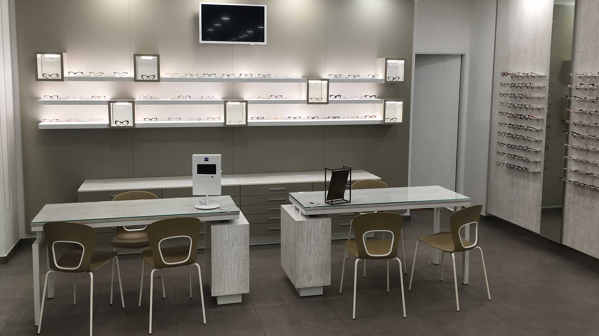
The two reserved sales counters were positioned at the back of the store in a more removed, private area suited to these activities.
By creating access to the lab through a new door in the existing partitions, we made a direct, more functional path. The fitting area stayed where it was, now closer to the reserved sales counter that was relocated. This increases the opportunity for synergy between the two stations.
With regard to the display, we maintained the same size, at the client’s request. However, we were able to modify it, allowing the glasses to be displayed more effectively based on style and category.
Special attention was paid to the storefront windows which now give outsiders a good look at the interior. A personalized touch was added to the window with the replication of the name “Valentina” in script, cut out of a large piece of sheet metal.
The lighting was varied so that the display panels now have backlighting in some areas and not in others, with more external light on the latter.

As usual, we divided the project into three macro steps:
To plan individual projects.
Technical checks after the partitioning and finishing touches have been completed.
Where we make sure the executive design and final product are consistent with each other.
During the delivery of materials, we had to personally “direct traffic” for a while due to the large truck and limited road space in front of the store.
We were able to complete the unloading quickly and to the client’s complete satisfaction.

For this project we did some R&D and made our first jointed display panels, connecting the sheets with lateral fasteners made of magnetic fittings.
This solution allowed us maximum continuity among surfaces on the same plane.
Professional and innovative. I would choose you again and again, considering the success our shop has had. The customers have shown great appreciation for the look of our store and even after a year, we keep getting compliments on the choice of materials, colors, and the kids’ section ("by Alessio") which truly seems like a work of art inside our store. We highly recommend your company based on your accessibility, support, and obviously the end result. Thank you for everything.
Subscribe to our newsletter to be always updated.